Lingo Bootcamp
Redesigning a paid English-speaking app whose method worked, but whose UI was costing it new sign-ups and stalling first-week confidence.
The Product
Lingo Bootcamp is a language learning app focused on giving users confidence to understand and speak English naturally. Our team redesigned the app experience to modernize the UI, streamline onboarding, and emphasize real instructor feedback.
Product Designer
8 Weeks
What this project achieved
Rebuilt onboarding, lesson playback, and instructor feedback around a calmer UI that surfaces the method inside the first session.
Trial users reach the moment the method clicks before they drop off, validated through usability testing with real students.
Pain Points
Client Perspective
The app delivered real value, but its outdated UI was costing the business new sign-ups. The team needed a refresh that matched what modern learners expected, without losing the teaching method that actually works.
User Perspective
Surveys with paying users surfaced one consistent frustration: the learning method worked, but getting started felt overwhelming. An unstructured flow and unintuitive interface made the first weeks feel harder than the language itself.
Target Market
Our initial target market is learners in Korea and Japan, particularly young adults preparing for working holiday programs. They seek affordable, mobile-first solutions to build real-life confidence and fluency in English, supported by repetition-based learning and real human feedback on pronunciation.
Competitor Analysis
We mapped Lingo Bootcamp's unique value against established competitors to identify differentiation opportunities.
| Feature | Lingo Bootcamp | Speak | Busuu | HelloTalk |
|---|---|---|---|---|
| Feedback from native speaker | ||||
| AI integration | ||||
| Focused in English Solo Speaking | ||||
| Zoom Classes Every Week | ||||
| KakaoTalk Invite Integration |
Solution
The teaching method already worked. The product around it did not. We focused the redesign on three layers the original app under-served: a modern, calmer UI; an onboarding that gives learners a structured first week; and a clearer place for the human teacher feedback that already differentiates the brand.
The goal was not to add features. It was to make the existing value visible inside the first session, so trial users actually reach the moment where the method clicks.
Modernized UI
Streamlined Onboarding
Real Instructor Feedback
Explore the Prototype
Swipe through key screens and user flows to experience the redesigned Lingo Bootcamp app.
1 / 19
Main Features
Key improvements to the app's core learning experience, each addressing specific user pain points.
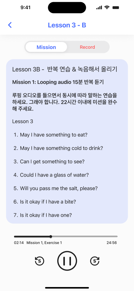
Music Player
Everyone nowadays listens to music on their phone. Changing the UI to a Music Player format makes it intuitive and familiar. We also split the page to let users listen to either the Full Class on the left, or ONLY the Looping Audio from the current app.

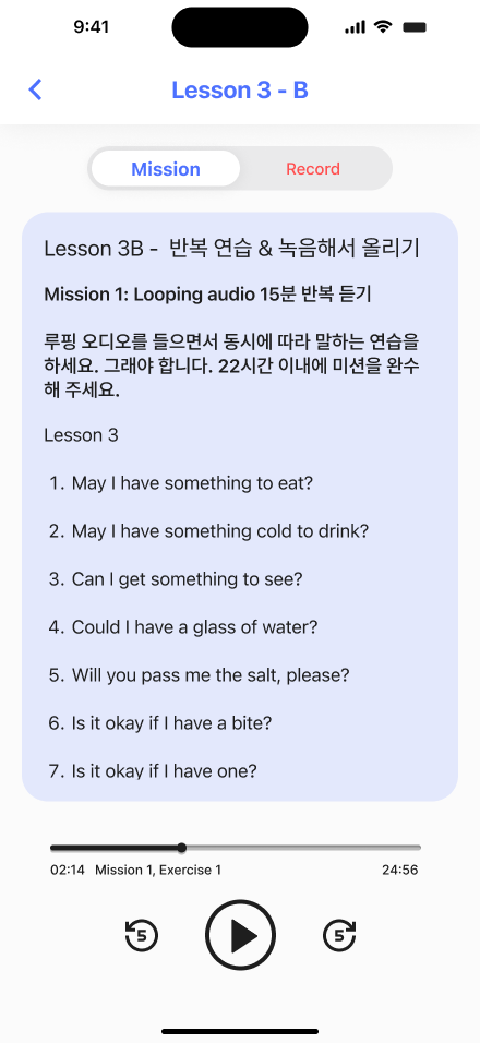

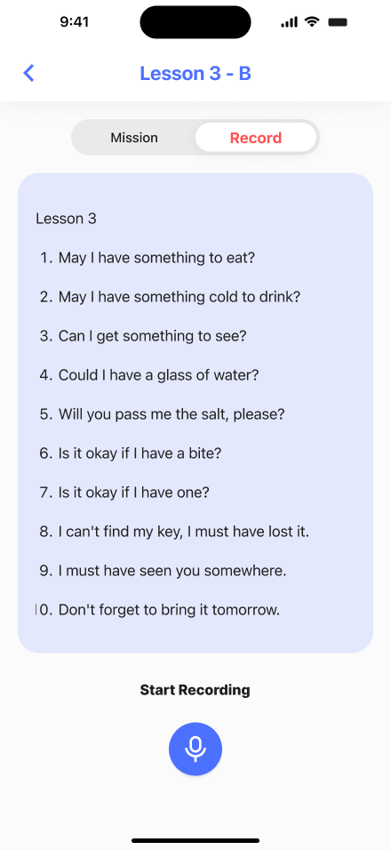
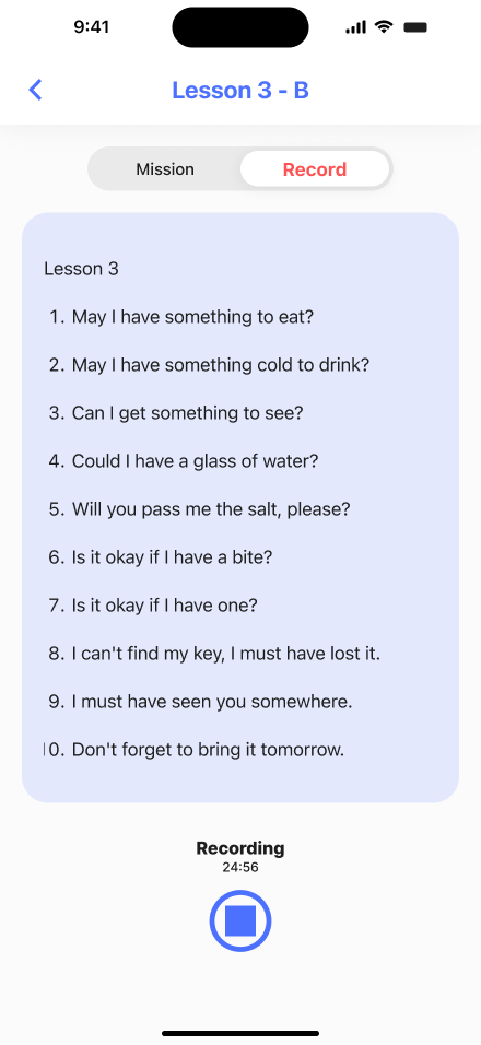
Lesson B: Recording
We kept the style of the current recording feature, but improved it by making the first tab display the lesson instructions, and the second a Karaoke-style screen to support users during the exercise, keeping the same aesthetics while boosting usability.


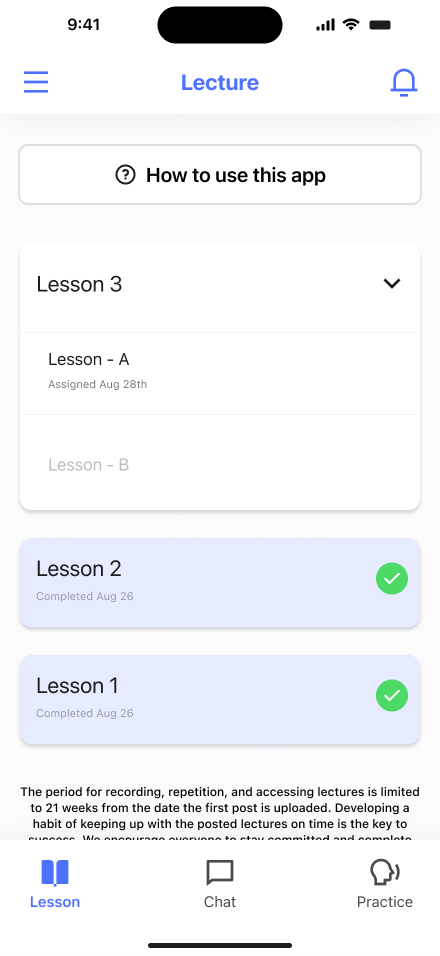
Lecture Tab
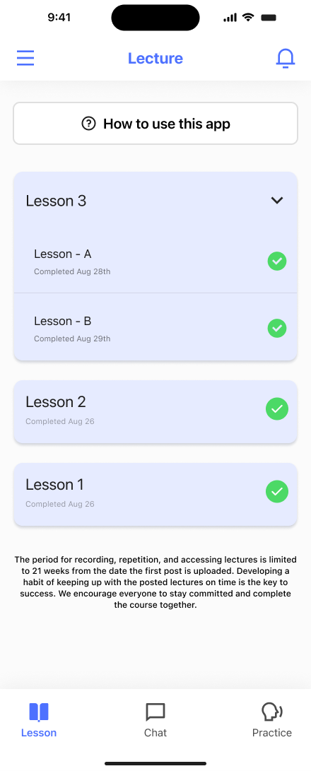
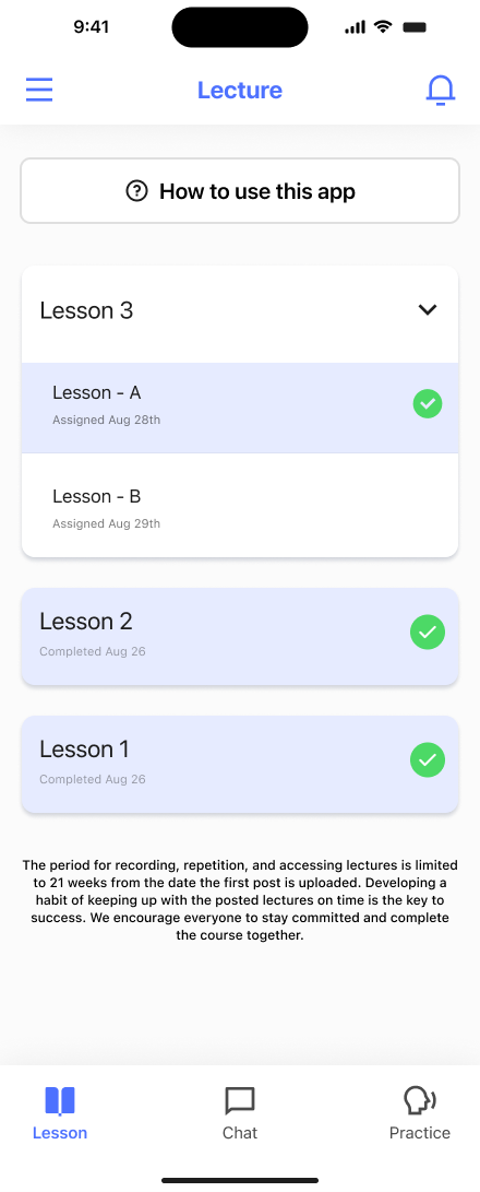
Creating a more organized Lecture Tab, including both Lessons A and B, makes the screen less cluttered. We also added notifications at the top of the page for easy access to both feedback and reminders.


Chat
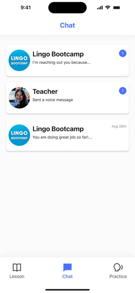
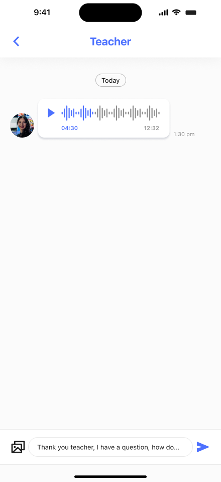
The communication style of the current app can sometimes feel like early 2000's chat forums. Our suggestion is to make the chat with teachers completely natural, the same way Kakao, Line, and Instagram work. Everybody knows how to use it!


Practice Mode
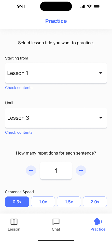
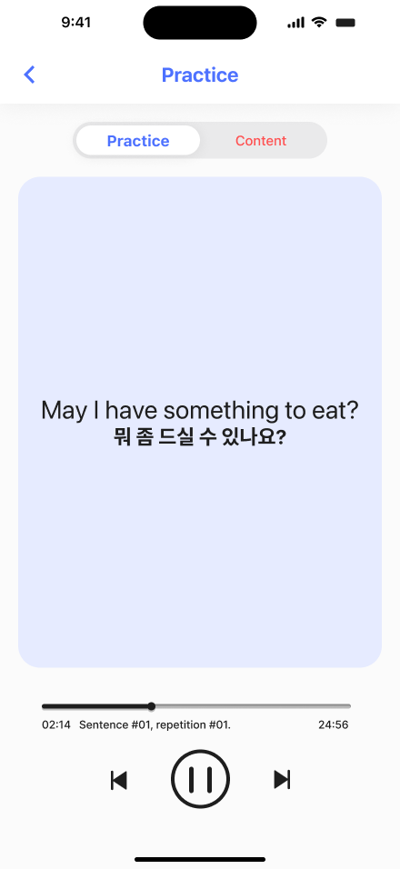
We focused on two key improvements. First, we enabled paid users to review previous lessons before completing the Bootcamp, unlocking new phrases immediately after each lesson. Second, since Missions emphasize repetition, renaming the feature to "Practice" signals it as an extra exercise for motivated learners. We clarified UI instructions and added a lesson overview screen for easy content revisiting.


Secondary Features
Additional improvements that enhance the overall experience, from personalization to visual polish.
Avatars
Personalized user profiles with custom avatar selection
Language Selection
Multi-language support for Korean, Japanese, and English interfaces
Technical Help
Built-in help center for troubleshooting and FAQs
Improved Feedback
Friendly mascot celebrations after recording submissions
Custom Notifications
Customizable notification schedules for lesson reminders
Lesson Progress
Clear visual indicators showing completion status per lesson
Music Player Style
Familiar audio UI inspired by modern music player apps
Karaoke Style
Follow-along sentence display during recording exercises
Modern Aesthetics
Refreshed visual design with a clean, contemporary look
Design Decisions
Users found the original lesson interface confusing. They didn't know how to replay or navigate audio. We reimagined the playback UI using a familiar music player metaphor.
Generic media controls with unclear play/pause states and no visual feedback on progress.
Full music-player-style interface with waveform progress, familiar controls, and split-view for full class vs. loop audio.
Leveraged existing mental models to reduce the learning curve. Users intuitively navigated lessons on first use.
Research showed students felt overwhelmed completing full lessons. Breaking them into digestible parts with progressive unlocking increased engagement and reduced drop-off.
Single long lesson format with all content loaded at once, causing cognitive overload.
Two-part lesson structure (A: Listen & Repeat, B: Record & Submit) that unlocks progressively and builds confidence step by step.
Progressive unlocking gave students a sense of achievement, directly reducing early drop-off rates.
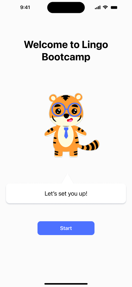
The original app had no onboarding. Users were dropped directly into the lesson list. We designed an onboarding flow that feels like a personal setup experience.
No onboarding. Users landed on a lesson list with no context, guidance, or personalization.
7-step guided onboarding covering language selection, notification preferences, study plan, and a sample lesson preview.
Personalized setup increased user commitment and reduced first-session abandonment significantly.
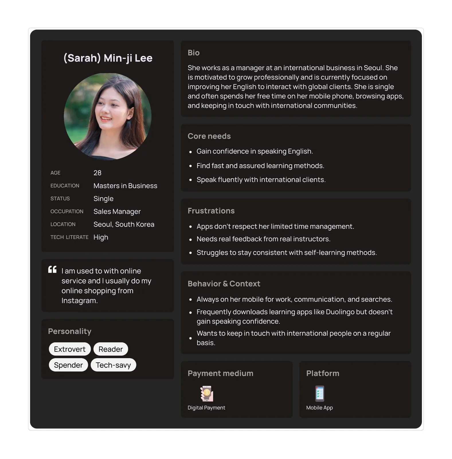
User Persona
Understanding our target user, a professional looking to improve English speaking skills for career growth and international communication.

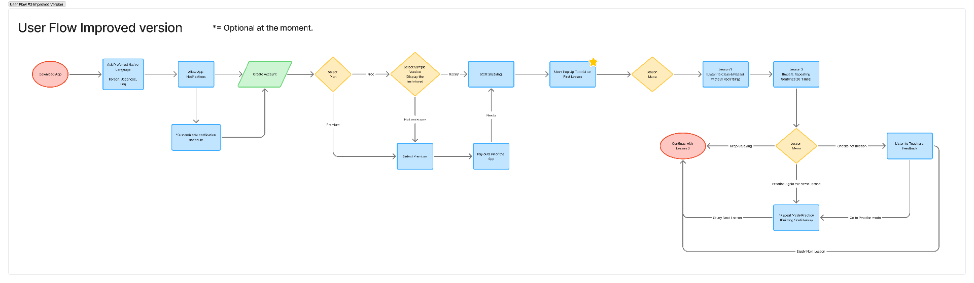
User Flow
Mapping the complete user journey from app download through lesson completion, identifying key decision points and user paths.

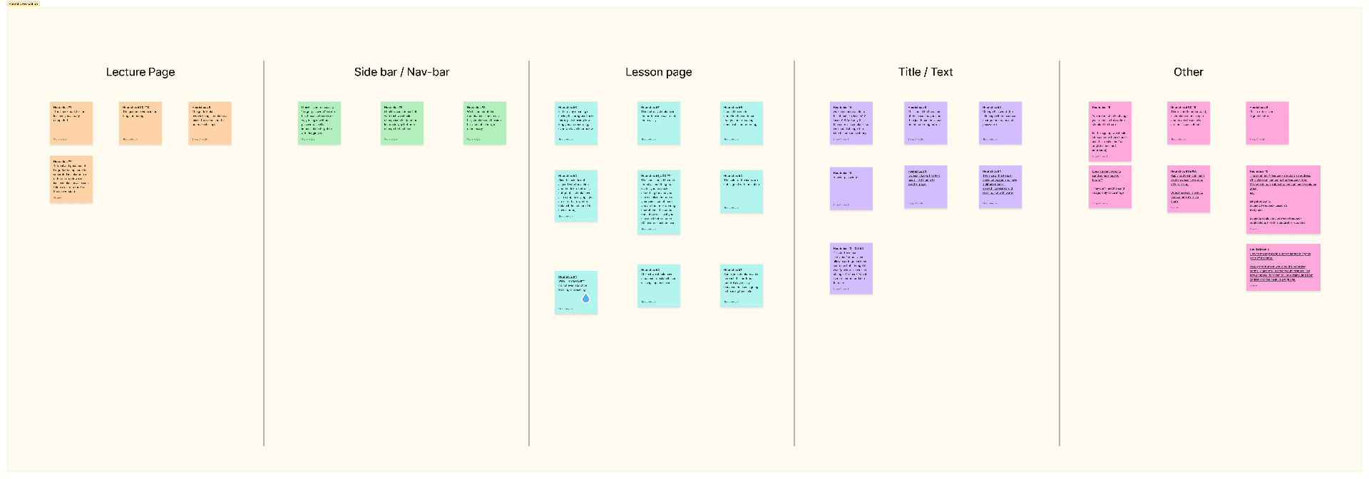
Heuristic Evaluation
Systematic evaluation of the app's usability against established design principles, categorized by screen type and interaction patterns.

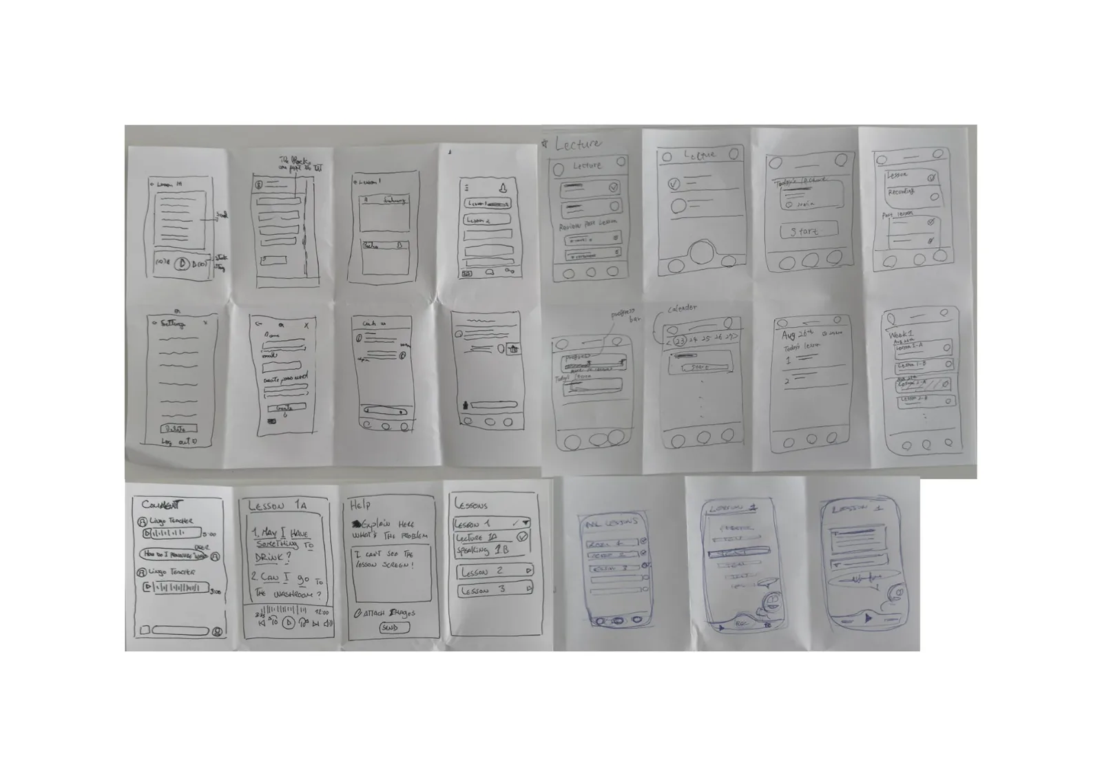
Ideation, Crazy 8s
Rapid sketching exercises exploring different layout options and interface concepts for key app screens including lectures, lessons, and settings.

Project Timeline
A 7-week structured sprint from research through final presentation and proposal delivery.
Week 1
- •Desk Research
- •Competitor Analysis
- •User Flow (current app)
- •1st Meeting w/ Client
Week 2
- •Proto Persona
- •User Journey Map
- •Heuristic Evaluation
- •Site Map (current app)
- •User Survey (real user)
- •2nd Meeting w/ Client
Week 3
- •User Flow Ver.2
- •Persona
- •Site Map Ver.2
- •3rd Meeting w/ Client
Week 4
- •Crazy 8
- •Mood Board
- •Wireframe (low-fidelity)
- •Character Drawing
- •Progress Presentation for Client
Week 5
- •UI Kit
- •Wireframe (high-fidelity)
- •Design Critique Session
- •Motion Graphic
- •Mockup
- •4th Meeting w/ Client
Week 6
- •Prototype
- •Usability Test
- •Improvement
Week 7
- •Making Slides
- •Preparation for Presentation
- •Proposal
What Students Say
Real feedback from Lingo Bootcamp students, measuring usability, confidence, and overall satisfaction.
""This is exactly the method I was looking for - a powerful learning approach that I really needed.""
- . Student with 20+ years English gap
""When I talked with my friends, I sometimes said the sentences I learned. It really helps!""
- . Active Learner
""Simple to use and convenient to study while on the go. Perfect for busy schedules.""
- . Mobile User
""I'm more used to speaking English than before. The repetition method really works.""
- . Confident Speaker
Key Takeaways
- •Reframed the core problem from "more content" to "structured speaking flow" so daily practice felt confidence-building instead of overwhelming.
- •Borrowed music-player and chat patterns to cut onboarding friction and let learners focus on speaking, not learning the app.
- •Designed repetition as a feature, not filler, so muscle memory replaced motivation as the engine of progress.
- •Validated the redesign through usability testing, which confirmed clearer progression beat feature parity in a crowded market.
Lingo taught me that learning products fail when they pile on features instead of designing for human motivation. The hardest part was cutting variety in favor of structure, even when competitors were adding more. I am taking forward the lesson that clarity and repetition outperform novelty when the goal is real behavior change.
Future Improvements
- Integrate AI-powered pronunciation scoring for real-time feedback during practice sessions
- Add a social layer where learners can practice with peers and share progress milestones
- Build adaptive lesson paths that adjust difficulty based on individual performance data
- Expand language support beyond English to serve Korean and Japanese learners in reverse
- Introduce spaced repetition for vocabulary retention alongside speaking practice